TEXT Jasmine Bible + PHOTOGRAPHY Cameron Reynolds Photography

DESIGNER Cheryl Luckett
LOCATION Huntersville, NC
INSTAGRAM @dwellbycheryl
WEBSITE dwellbycheryl.com
Follow along with Luckett for more home design inspiration, and to enroll in her semi-annual design courses.
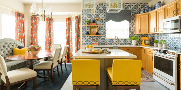
Admittedly, Cheryl Luckett isn’t a cook. She’s a highly sought after interior designer with little time left over to work on her own home. The kitchen in her 1990s cottage bungalow in Huntersville, North Carolina, had served her minimal cooking needs well enough for 13 years, but when the time came to finally take the plunge, she knew she wanted to create a functional space that was not only full of color and pattern, but also meaningful.
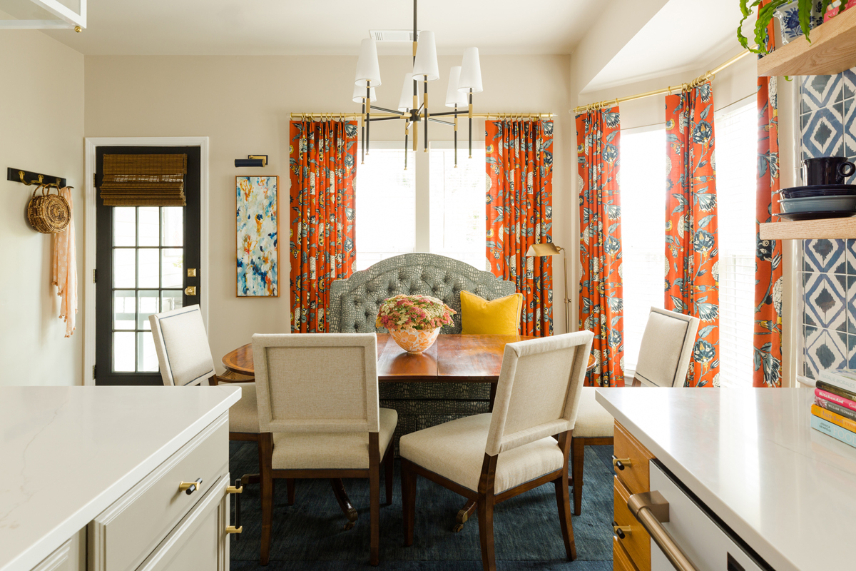
“Design is about creating a pretty space, but it’s so much more than that. It’s really about crafting a space that is a representation of who you are and the things you love,” explains Luckett. Perhaps unsurprisingly, the layout started with the Magnolia banquette from her own five-piece capsule collection for Sylvester Alexander furniture, Belle by Cheryl Luckett. The lines of the silhouette are reminiscent of her Mississippi roots, finished in a luxe chenille fabric by Revolution Performance Fabrics.
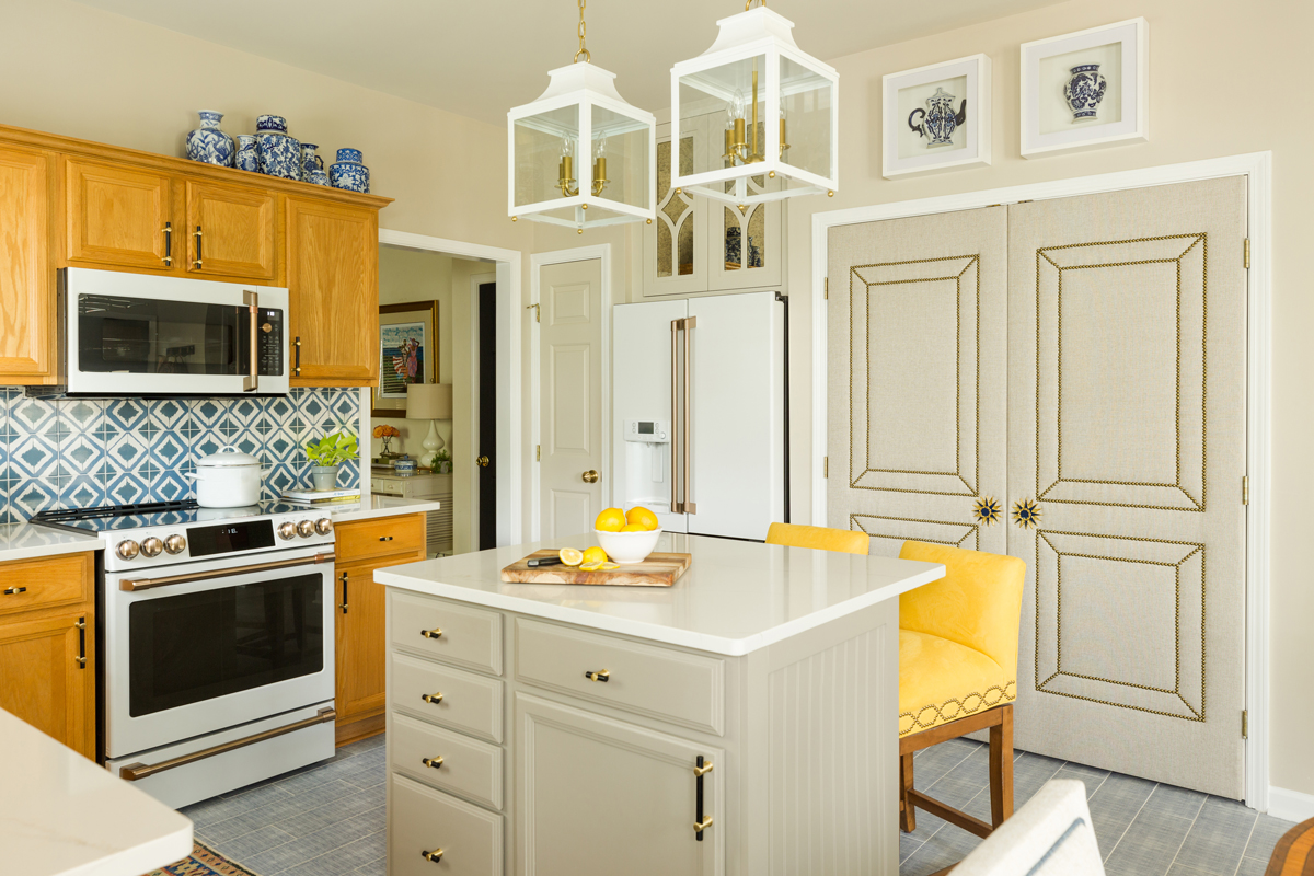
With the banquette set, she moved onto the color scheme, beginning with the cabinets. While the popular opinion may have been to repaint the cabinets, Luckett chose to keep the honey oak finish: “The floors in the living room are also honey oak, so to have some connectivity throughout the home, I chose to work with it, and in doing so, that really drove the entire color scheme.” The quartz countertop and the matte black hardware from Schaub completely transform their look.
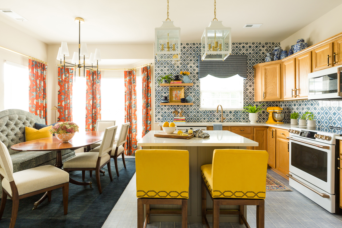
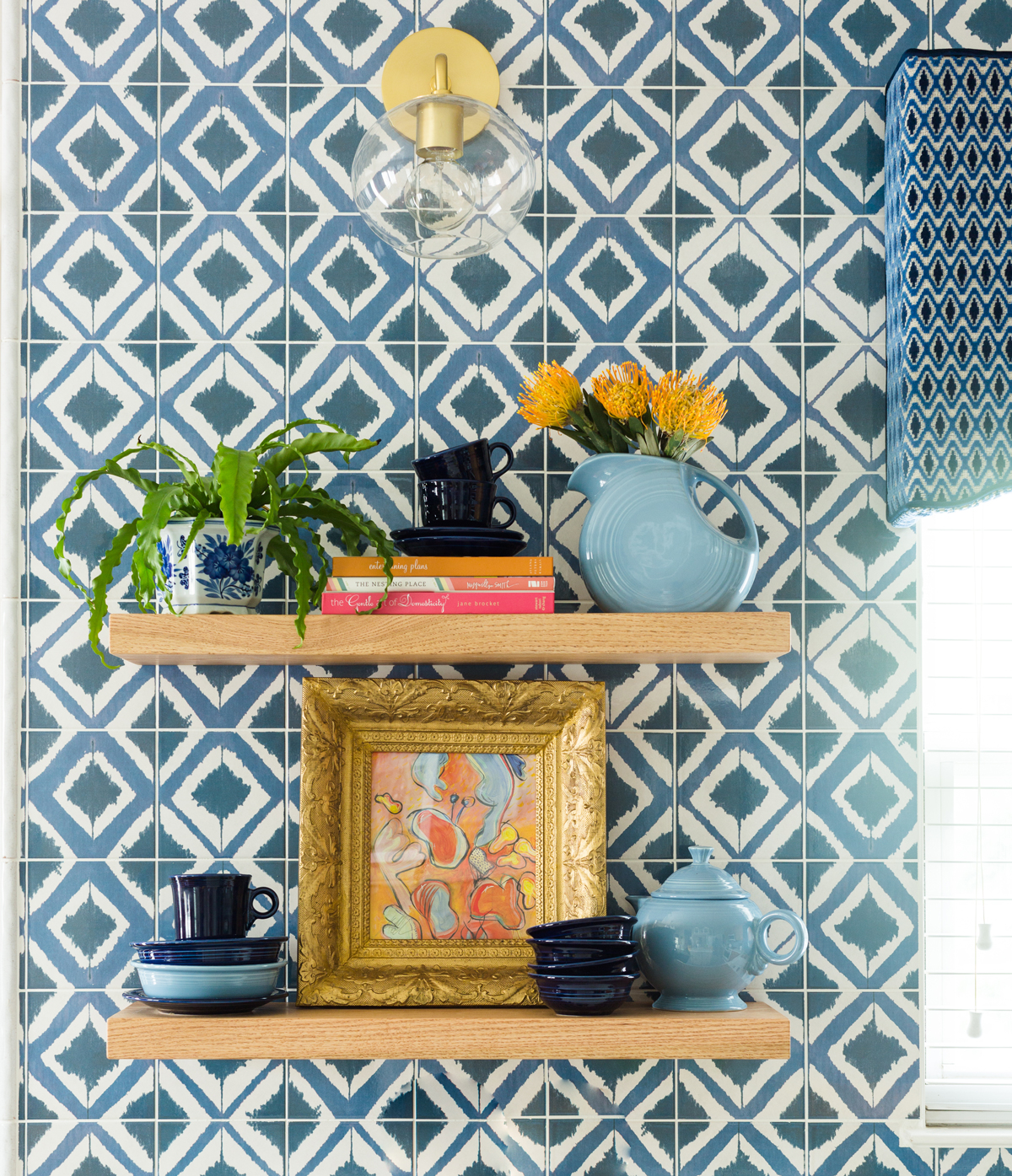
To counterbalance the warmth of the cabinets, Luckett chose complementary blue for the floors and backsplash. She fell in love with the ikat-esque pattern of the Annie Selke Shadow Navy ceramic tile from the Tile Shop, confident it would make the type of bold statement for which she’s known.
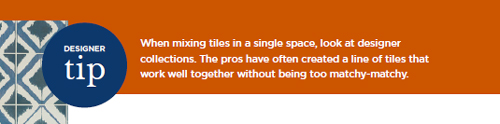
For the floor, she chose to not overpower the wall pattern, selecting the subtle Watercolor Lines pattern from the same Annie Selke collection, knowing the colors would work well together. “The flooring pattern resembles seersucker suit fabric, and everyone, especially men, always reach down to touch it,” laughs Luckett.
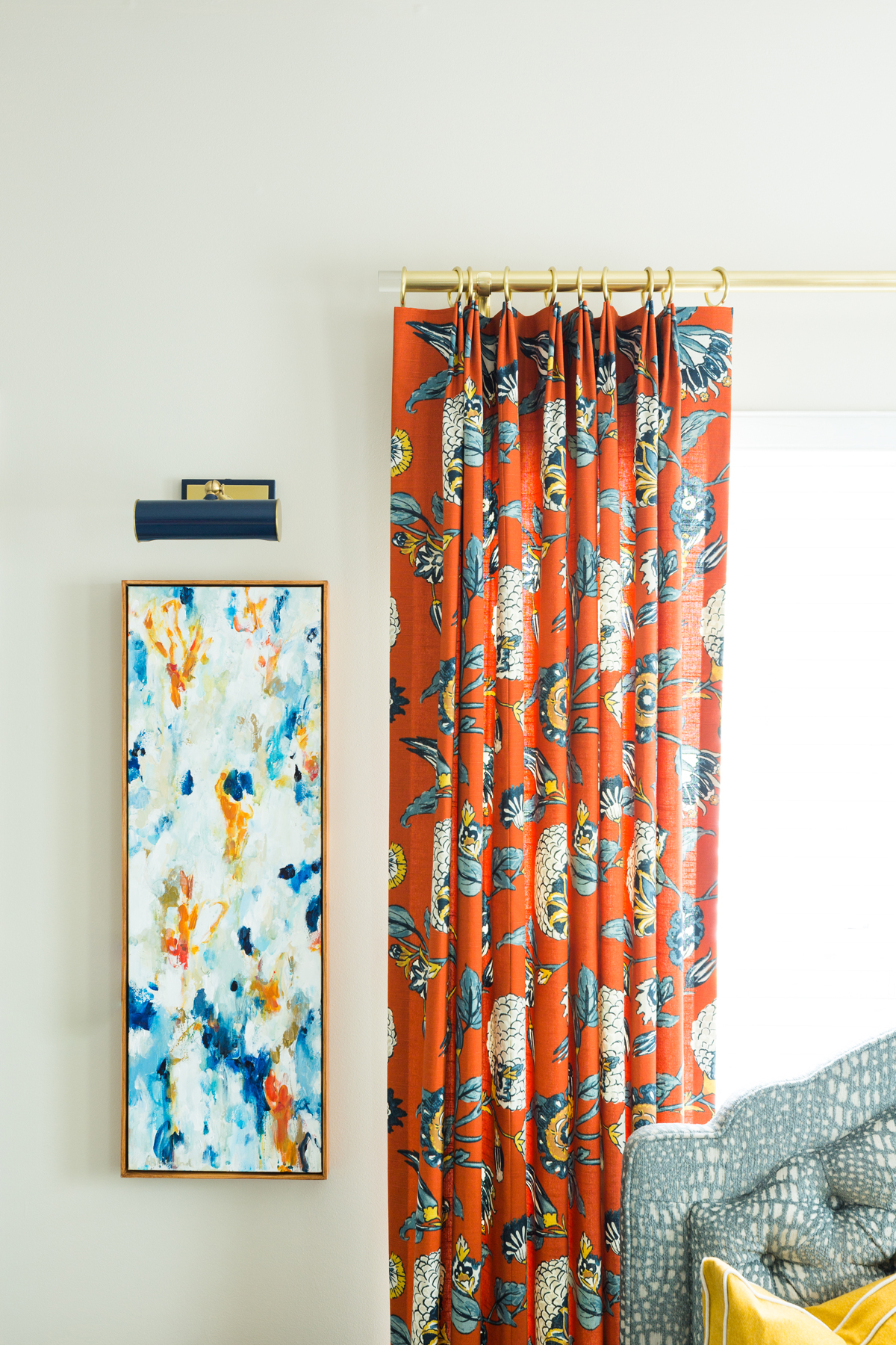
For the draperies, Luckett chose Auretta in persimmon from Robert Allen’s Dwell Studio collection, which perfectly encompasses the oranges and blues while offering additional colors to pull from. One of Luckett’s favorite bits of design advice? “Start with a thing!” she says. Find something you absolutely adore and let it dictate the entire color story. Knowing that colors work together gives you the clarity and conviction to make fun choices, like the yellow bar stool fabric, matched to a yellow in the draperies.
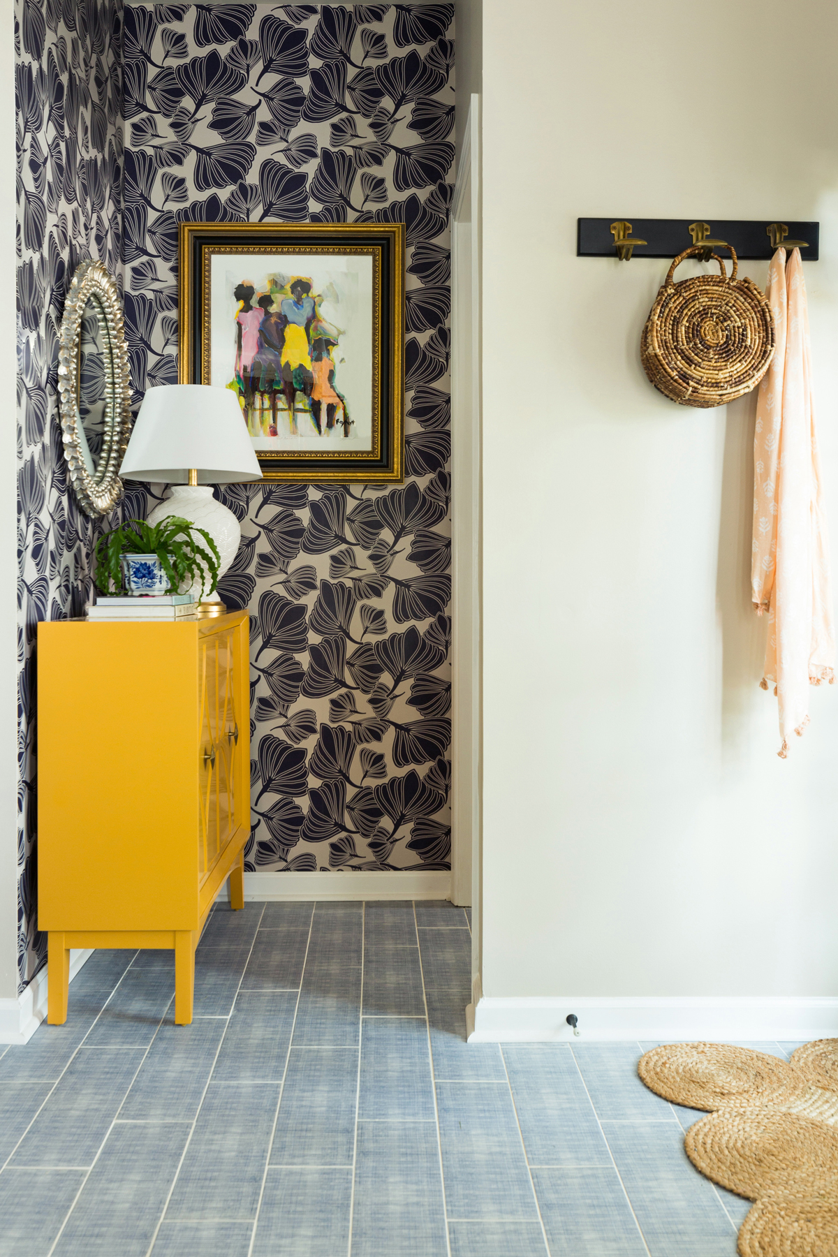
Clever functional solutions are peppered throughout, including the beautiful antique mirrored cabinet above the refrigerator, which hides her TV—a must for Sunday football. The laundry closet got a glamorous upgrade thanks to custom upholstery with nailhead detailing and show-stopping hardware from Adison Weeks, a Charlotte-based jeweler and designer. The once forgettable corner nook now serves as a mudroom, the slender console providing a landing spot for keys and sunglasses while gardening boots and yoga mats tuck neatly inside. The navy-on-white Tulip Seed wallpaper from Milton & King makes the small space feel special. Ray Heart artwork that reminds Luckett of her mom and sisters, along with a mirror from Wildwood Home, layer perfectly on top.
The icing on the cake is the lighting, all supplied by Hudson Valley, which brilliantly mixes traditional and modern pieces. When there wasn’t an outlet in the corner for the table lamp, Luckett had one installed. “Don’t let electrical scare you off. It’s a simple task for an electrician to add an outlet for a lamp, or install a wall sconce, or art light. The half-day rate is absolutely worth being able to add varying levels of lighting,” she emphasizes.
Luckett’s final bit of advice? Head to Instagram to seek out local artisans and tradespeople. In this project alone she found and used local decorative painter Alicia Slayton of Organize-Create-Decorate to paint the island, local firefighter and woodworker Char’d Urban Wood Works for the white oak floating shelves, and Allison Ford Photography for the custom artwork between the door and the banquette. “Instagram has become somewhat of an online directory. It’s a great way to connect with and support local artisans in your community.”
To connect with Ford, visit dwellbycheryl.com.
We shared this House Tour with you in the Spring/Summer 2021 Issue of NEST Magazine. To view the full issue, click here.
Ready to see more House Tours? Click through for a dose of inspiration: Costal Prep, Vintage Eclectic, Boho Sister Space, Global Chic, Mid-Mod, New Traditional, and the fab She Shed!
Morgan Burns
Written on
Awesome points such a beautiful full post, thanks for the info.