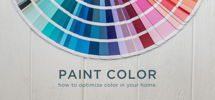
Getting started on a painting project? Feeling uninspired? Nest is here to help! Learn design strategies to optimize the impact of paint color in your home.
Color Me Confused

Sometimes design lingo can be intimidating. Words you thought you knew take on new significance in the field of design. Here is a simple glossary to guide you in your decision making process.
- Tint: A lighter version of a basic color. (When white is added to the paint color. Example: Pink is a tint of red.)
- Shade: A darker version of a basic color. (When black is added to the paint color. Example: Maroon is a shade of red.)
- Tone: The lightness or darkness of an object.
- Warm tones: Reds, yellows, oranges, and beiges are usually considered warm.
- Cool tones: Blues, greens, grays, and purples are usually considered cool.
- Complementary colors: Any two colors that are directly opposite each other on the color wheel.
A well-composed interior will include a variation of shades, tones, and tints.
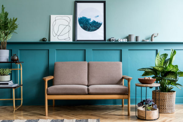
The Dark Side

It’s time to bust the myth that a dark paint color will make your space appear smaller. In fact, incorporating dark shades is trending. Classic Blue, a deep cobalt and Pantone’s 2020 color of the year, tells us as much. The right dark shade is like mood lighting—sophisticated and intimate. If you still feel hesitant, consider the following approaches.
- Experience the best of both worlds with a two tone paint job.
- Limit the dark shade to a focal wall while painting the rest of the room a neutral white. This low stakes and low commitment approach is understated and elegant.
- Couple a dark shade with light, neutral decor to create contrast. High levels of contrast delivered with confidence are an edgy and modern design move.
Paint Boldly
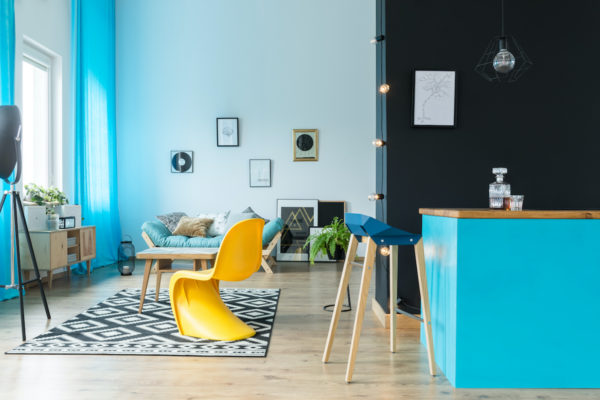
Bright, saturated paint is an inexpensive way to inject new life into a room. Limit your hue to one wall for a bold statement. This approach can also transform small, overlooked, and undervalued spaces like mud rooms or hallways with stop-you-in-your-tracks color.
The Golden Rule
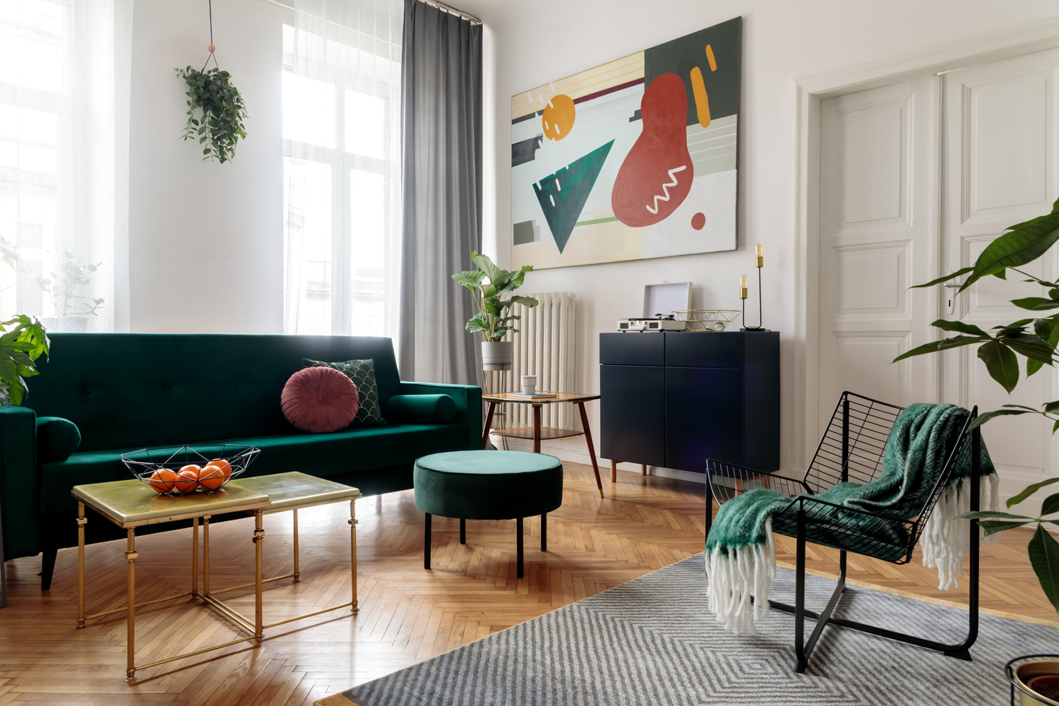
The 60-30-10 rule is used by designers to determine the correct ratio of colors in a given space. An ideal palette should include 60% of a dominant color, 30% of a secondary color, and 10% of an accent color. This creates a cohesive pattern within the room. Generally, the paint color will take center stage. The secondary color can be represented through area rugs, furniture, and art. Throws, pillows, and decorative vases are great accent pieces. Base your secondary and accent colors on their relationship to their dominant counterpart. Consult the color wheel to pinpoint the best combination for your space.
Whether you take it easy with color or dive in head first, you’re on your way to designing bold new spaces!